Canadians love the maple leaf.
We put it on our flag. Our coins. Our backpacks when travelling internationally. Hockey jerseys. Coffee mugs. Probably at least three things in your kitchen right now.
The maple leaf is so connected to Canadian identity that people rarely stop to ask an important question:
What maple leaf actually is it?
Because here's the funny thing — not every maple leaf is "the Canadian maple leaf." In fact, people constantly use the wrong one.
Entire companies, tourism campaigns, souvenir brands, and even well-meaning Canadians have accidentally used leaves from completely different maple species without realizing it.
And once you learn how to spot the differences, you start seeing fake Canadian maple leaves everywhere.
It becomes a problem.
A very Canadian problem.
First: There Is No Single "Canadian Maple Tree"
Canada has many native maple species. Some of the most common include:
- Sugar maple
- Red maple
- Silver maple
- Bigleaf maple
- Manitoba maple
- Black maple
But when most people think of the iconic Canadian maple leaf, they're usually imagining the sugar maple.
Specifically: the leaf shape used on the Canadian flag was primarily inspired by the sugar maple, even though the final flag design was stylized rather than copied directly from a real leaf.
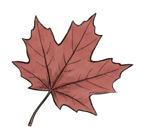
The sugar maple is famous for its vibrant fall colours and, of course, maple syrup.
It's basically the celebrity maple.
So Why Do People Keep Using the Wrong Maple Leaf?
Because maple leaves are surprisingly complicated.
To non-tree-obsessed humans, they all kind of look like "maple-shaped leaves." But botanists, arborists, and increasingly deranged Canadians online can spot the differences immediately.
The biggest offender?
The Norway maple.
The Norway maple is native to Europe and was widely planted across North American cities because it grows quickly and tolerates urban conditions well.
Unfortunately, its leaf shape is just similar enough to confuse designers searching "maple leaf" on the internet at 2 a.m.
And this has led to decades of accidental botanical betrayal.
The Great Canadian Maple Leaf Identity Crisis
Over the years, people have discovered "Canadian" branding using leaves that are very obviously not Canadian sugar maples.
This happens constantly.
Tourist shops. Corporate logos. Stock photography. Patriotic social media graphics. Even municipal decorations.
One of the funniest recurring internet traditions is Canadians collectively spotting fake maple leaves and reacting like amateur forensic investigators.
Someone posts a patriotic image online. Within minutes:
"That's a Norway maple."
There's something deeply Canadian about becoming emotionally invested in leaf accuracy.
The Famous Olympic Leaf Debate
One of the better-known examples happened around the time of the 2010 Winter Olympics in Vancouver.
People online started debating whether certain promotional designs and decorative maple leaves looked suspiciously like Norway maple leaves rather than sugar maple leaves.
Now, to be fair, many logo designs are intentionally stylized and simplified. Designers often prioritize symmetry and readability over botanical accuracy.
But Canadians absolutely noticed.
Because apparently our national pastime isn't hockey.
It's leaf verification.
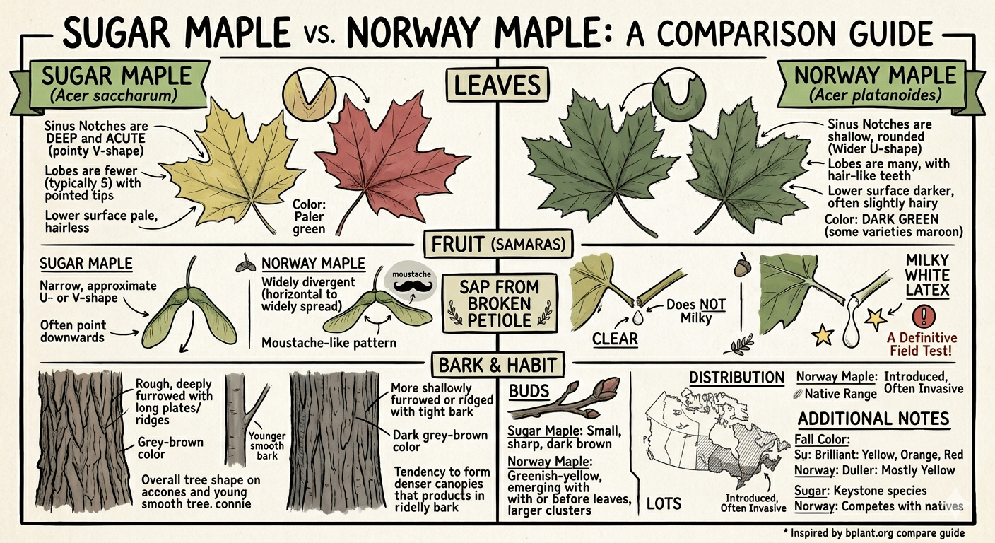
How to Actually Identify a Canadian Sugar Maple Leaf
Here's the simplest way to recognize a sugar maple leaf versus a Norway maple leaf.
Sugar Maple Leaf Features
A real sugar maple leaf usually has:
- Smooth, rounded U-shaped spaces between the points
- Softer-looking curves overall
- Five main lobes
- Less sharply pointed edges
- A balanced, slightly elegant shape
The leaf feels classic and flowing. Think: peaceful autumn postcard.
Norway Maple Leaf Features
Norway maple leaves tend to have:
- Sharper, more aggressive points
- Deep cuts and jagged angles
- A wider, tougher appearance
- More triangular geometry
They look slightly more dramatic and rigid. Think: corporate landscaping tree outside a dental office.
The Sap Trick Tree Nerds Love
There's also an extremely nerdy but effective identification trick.
If you break the stem of a Norway maple leaf, it produces a milky white sap.
Sugar maples do not.
This is the kind of information that transforms ordinary Canadians into tree detectives during walks.
You'll never casually look at a maple leaf again.
Why the Canadian Flag Leaf Doesn't Match Perfectly
The maple leaf on the Canadian flag isn't meant to perfectly replicate a real leaf from nature.
When the modern Canadian flag was designed in 1965, the final leaf was simplified to work clearly in fabric, wind, and at long distances.
Tiny details disappear on flags, especially when flapping around in February weather while someone eats poutine nearby.
So the designers created a clean, symmetrical version inspired largely by the sugar maple while emphasizing bold visibility.
Which was probably the correct choice.
A botanically perfect maple leaf on a flag would look oddly chaotic.
Nature is messy. Graphic designers fear this.
Canadians Are Weirdly Protective About This
The funny part is that most Canadians probably couldn't identify individual maple species on command.
But the moment someone uses the wrong leaf in an overly patriotic context, people suddenly become honorary forestry experts.
There's something charming about that. It shows how deeply the maple leaf matters culturally. Even subconsciously, Canadians recognize it as more than just a tree symbol.
It represents seasons. Landscape. Identity. Home.
Also syrup.
Mostly syrup.
Final Thoughts
The Canadian maple leaf is more complicated than it looks.
The iconic version is rooted mainly in the sugar maple, though the flag itself uses a stylized design rather than a scientifically exact leaf.
And despite decades of accidental Norway maple imposters sneaking into logos and souvenirs, Canadians remain surprisingly vigilant defenders of proper maple representation.
Honestly, it's kind of beautiful.
Other countries argue about politics.
Canada sometimes argues about leaf geometry.
And somehow that feels exactly right.